Chapter 5 Lab 4: Scientific Visualization with ggplot2
Objectives:
- To understand the Grammar of Graphics used by ggplot2
- To map variables to aesthetics (x, y, fill, color)
- To build histograms and bar plots
- To design a publication-quality chart
One of the clearest ways to present results is by plotting them. This chapter focuses on the ggplot2 package, the most widely used plotting package in R.
5.1 The Grammar of Graphics
ggplot2 builds plots in layers using a consistent syntax:
ggplot(data = <data>, aes(x = <variable>, y = <variable>)) + geom_<type>()data =tells ggplot which data frame to useaes()(“aesthetic mapping”) tells ggplot which columns go on which axis (and optionally, color/fill)geom_<type>()tells ggplot what kind of plot to draw (bars, points, lines, etc.)
Make sure your data is “tidy”: each variable you want to plot should be in its own column.
5.2 Installing and loading ggplot2
R Packages
An R package is a collection of code, data, and functions that
extends what R can do.
Installing a package
Write this once in the CONSOLE:
install.packages(‘ggplot2’)
Loading a package
Add this to a code chunk in your R Markdown notebook:
{r} library(ggplot2)
We’ll practice with R’s well-known palmerpenguins data set. Install it if you haven’t already (install.packages("palmerpenguins")), then load both packages:
Question 1
-
Load
ggplot2andpalmerpenguinsin your own notebook -
Use
str(penguins)orhead(penguins)to explore the data. What are the columns, and what class is each one?
5.3 Histograms
A histogram shows the distribution of frequency of a continuous value. The x-axis holds the continuous values (binned into intervals) and the y-axis holds the count.
## Warning: Removed 2 rows containing non-finite outside the scale range (`stat_count()`).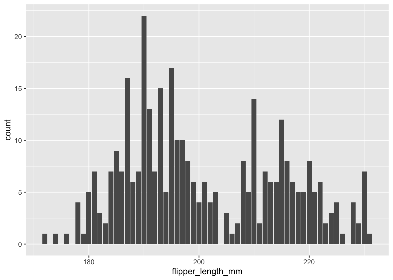
We can add color to separate categories, for example by species:
## Warning: Removed 2 rows containing non-finite outside the scale range (`stat_count()`).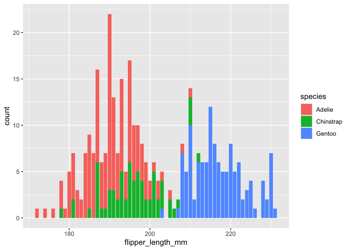
Question 2
-
Make a histogram of
bill_length_mm, colored byspecies. Add the code and a short interpretation: do the species overlap or separate?
5.4 Bar plots
Bar plots represent a continuous variable across discrete categories. A good example: the number of penguins per species per island.
## # A tibble: 5 × 3
##   species   island        n
##   <fct>     <fct>     <int>
## 1 Adelie    Biscoe       44
## 2 Adelie    Dream        56
## 3 Adelie    Torgersen    52
## 4 Chinstrap Dream        68
## 5 Gentoo    Biscoe      124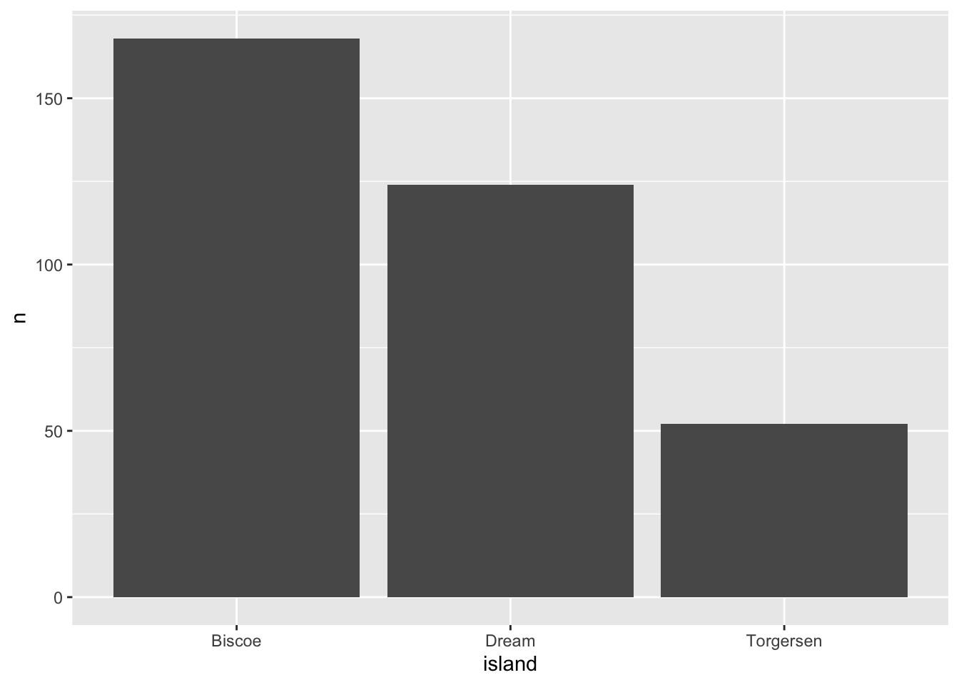
The stat="identity" flag tells ggplot to use the actual value in n for the bar height, instead of counting rows.
Add fill=species to break each bar down by species:
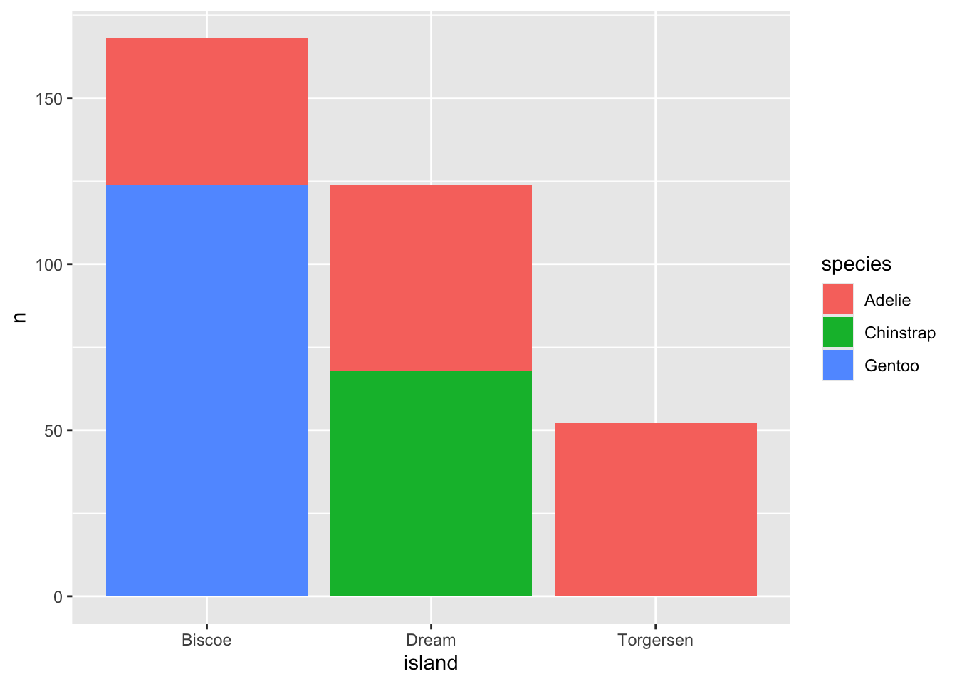
This is a stacked bar chart. To place bars for each category side-by-side instead, add position="dodge":
ggplot(data = penguin.island, aes(x=island, y=n, fill=species)) + geom_bar(stat = "identity", position = "dodge")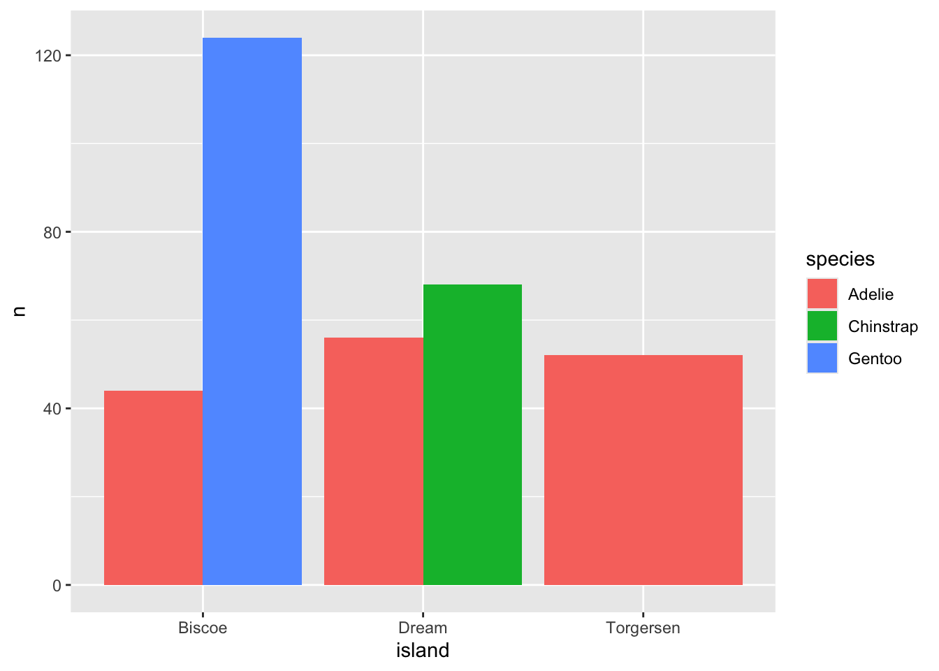
Question 3
- Which islands have only one species of penguin, and which have more than one? Use the plots above to answer.
-
Recreate the
penguin.islandsummary but grouped byspeciesandsexinstead ofspeciesandisland. Plot it as a dodged bar chart.
5.5 Publication-quality touches
A few small additions go a long way toward making a plot presentation-ready:
ggplot(data = penguin.island, aes(x=island, y=n, fill=species)) +
  geom_bar(stat = "identity", position = "dodge") +
  labs(title = "Penguin counts by island and species",
       x = "Island", y = "Number of penguins", fill = "Species") +
  theme_minimal()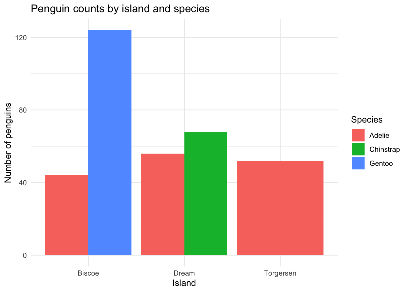
labs()sets a title and axis/legend labelstheme_minimal()(ortheme_bw(),theme_classic()) strips ggplot’s default gray background
Question 4
- Take one of your plots from this lab and add a title, clear axis labels, and a theme of your choice
- In 2-3 sentences, explain why labeling and theming matters when sharing a plot outside of your own notebook (e.g., in a paper or presentation)